Overview
The project involved redesigning the Digital School Management platform, utilized by students, teachers, and parents, to enhance its user interface (UI), improve usability, and elevate the overall user experience. The goal was to create a visually appealing and intuitive platform that facilitates effortless access to academic resources and communication channels.
Role
UX Designer
TAsk
- User Interface Design - User Experience Design - Interaction Design - Information Architecture - Rapid Prototyping - User Reserch

problem STATEMENT
The current UI/UX design of the Digital School Management platform lacks user-friendliness and aesthetic appeal, hindering seamless navigation and utilization of its features.
Objectives & Goals
The objective of this project was to redesign the Digital School Management website to: Enhance the user interface Improve usability Elevate the overall user experience The goal was to create a visually appealing and intuitive platform that facilitates effortless access to academic resources and communication channels.
DESIGN PROCESS

Identification of problem and
empathizing with users
Identified challenges like poor navigation, unclear statistics, and missing features. Gathered feedback from students, teachers, and parents.

RESEARCH
Engaged with stakeholders, including students, teachers, and parents, to gather feedback on their experience and understand their needs.

ideation
Refined objectives based on feedback. Prioritized improvements aligned with user needs.

SKETCHING & WIREFRAMING & DESIGNING
Designed wireframes and prototypes incorporating feedback and best practices to redesign a user-friendly and visually appealing interface.
USER PERSONA

Francois Mamadou, 39, an educator in Ivory Coast seeks a user-friendly digital school platform to streamline administrative tasks and improve communication.
Frustration
1. No language toggle button. 2. Poorly presented statistics. 3. Difficulty identifying logged-in user. 4. Hard to manage notifications and messages. 5. Poor visual hierarchy and inconsistent fonts.
GOALS
1. Improve User Experience 2. Enhance Communication 3. Simplify Tasks.

Usability Study
Round 1
1. Lack of language toggle and unclear login indicators. 2. Difficulty managing notifications and accessing messages. 3. Poor visual hierarchy and inconsistent font sizes.
Round 2
1. Ineffective search button 2. Need for comprehensive and customizable statistics for deeper insights.
SOLUTIONS


Problem
Absence of a language toggle button.

SOLUTION
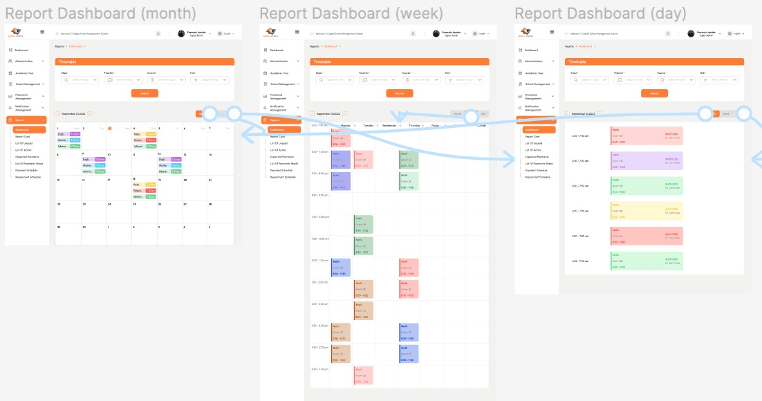
Redesigned the statistics section to present data clearly and organized, making it easier for users to interpret and derive meaningful insights.

Problem
Poor presentation of statistics.
SOLUTION
Introduced a language toggle button in the dashboard to enhance accessibility for users who prefer different languages.

Problem
Lack of clear login indicators and user identification.
SOLUTION
Added clear indicators and labels to show which user profile is logged in, enhancing user identification and reducing confusion.